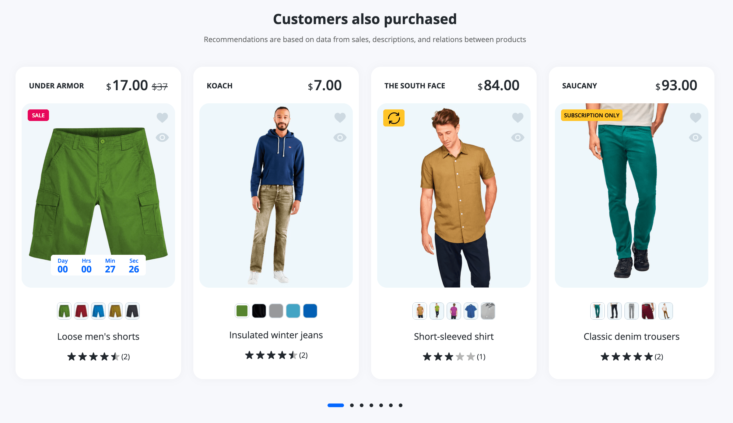
Recommended Products default
You can add a section to your product pages that displays an automatically-generated list of product recommendations. Displaying recommended products to customers makes it easier for them to discover new products, and can help to increase online store sales.

Enabled by default: Yes
Sortable section: Yes
Widgets limit per page: 1
Asynchronous: Yes (100% passes page speed insight metrics)
Visibility: Product page
Recommendation logic
The recommendation algorithm predicts the most relevant products based on the product a customer is interacting with. The criteria that the algorithm uses depends on the recommendation intent and a merchant's online store. In general, it might take into account the following factors:
- Purchase history - Finds products that have historically been purchased together.
- Product description - Finds products with similar descriptions.
- Related collections - Finds products from collections that the current product is part of, excluding collections with handles all and frontpage.
Steps to enable
- From your Shopify admin, go to Online Store > Themes.
- Find the Lumia theme that you want to edit, and then click Customize.
- Click Theme settings.
- Click Product page.
- To enable carousel layout, uncheck the Infinite scroll checkbox.
- Click Save.
ℹ️
- Products that are out of stock or set to a price of 0, gift cards, and products in the visitor's cart aren't included in recommendations.
- You can't customize the recommendation algorithm to exclude specific products. However, you can choose which of the returned - products to show with JavaScript
Admin interface
| Option Name | Type | Values | Default | Description |
|---|---|---|---|---|
| General | ||||
| Heading | Text | You may also like | Main section heading | |
| Sub Heading | Textarea | Infinite lazyloaded related products from the same category might interest you | Secondary section heading under the main heading | |
| Limit products by | Range | 5-12 | 8 | Products limit forthe carousel layout |
| Infinite scroll | Checkbox | • True • False | True | Enables an infinite grid layout |
| Box Margin | ||||
| Vertical space above the section on the desktop | Range | 0-200 | 100 | Top space in px |
| Use global space on the desktop | Checkbox | • True • False | True | If true then the global dekstop margin (100px) is used, not the section-specific |
| Vertical space above the section on the Mobile | Range | 0-100 | 70 | Top space in px |
| Use global space on the Mobile | Checkbox | • True • False | True | If true then the global mobile margin (70px) is used, not the section-specific |
| Box Background | ||||
| Enable secondary background | Checkbox | • True • False | False | This option sets an individual widget background color for visual focusing |
| Box Padding (Usefull only if was enabled secondary background for current section) | ||||
| Vertical inner padding on the Desktop | Range | 0-200 | 100 | Top space in px |
| Use global inner padding on the desktop | Checkbox | • True • False | True | If true then the global desktop padding (100px) is used, not the section-specific |
| Vertical inner padding on the Mobile | Range | 0-100 | 70 | Top space in px |
| Use global inner padding on the Mobile | Checkbox | • True • False | True | If true then the global mobile padding (70px) is used, not the section-specific |