Main Cards
Our fresh look at the product card that we use as the main one in our demo for its novelty, balance and compactness. Check it out on the live demo ↗ (opens in a new tab).

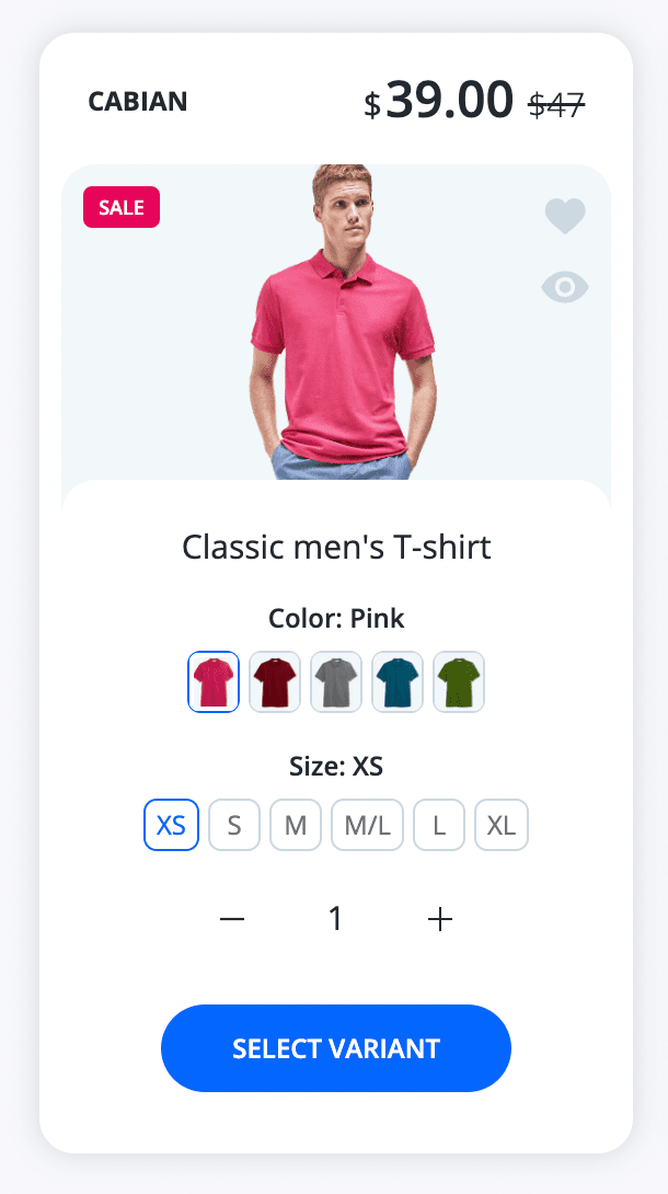
Passive state | 
Hover state |


Enabled by default: Yes
Visibility: Product carousel sections, product grid sections, collection page grid and collection page sections, product page sections.
Steps to enable
- From your Shopify admin, go to Online Store > Themes.
- Find the Lumia theme that you want to edit, and then click Customize.
- Click Theme settings.
- Click Product card.
- Select Modern from the Layout dropdown.
- Click Save.
States
The state is an automatic type of card depending individually on the product itself that you create in the store control panel and the product card settings that you configure in our theme.
No Options

Passive state | 
Hover state |


Enabled by default: Auto
Dropdown options

Passive state | 
Hover state |


Enabled by default: No / Auto (auto means that if the product has many options, then the dropdown mode will be forced)
// Below is a theme LIQUID code for those who want to re-customize the AUTO mode logic
// Path of file snippets/variant_picker.liquid
// ...
if product.options.size == 1 and product.variants.size > 10
    assign picker_type = 'dropdown'
elsif product.options.size == 2 and product.variants.size > 36
    assign picker_type = 'dropdown'
elsif product.options.size == 3 and product.variants.size > 100 or layout == 'product-sticky'
    assign picker_type = 'dropdown'
endif
// ...
Steps to enable
- From your Shopify admin, go to Online Store > Themes.
- Find the Lumia theme that you want to edit, and then click Customize.
- Click Theme settings.
- Click Product card.
- Select Dropdown from the Variant picker > Type selectbox.
- Click Save.
Pics options
Passive state |
Hover state |
Enabled by default: No
Steps to enable
- From your Shopify admin, go to Online Store > Themes.
- Find the Lumia theme that you want to edit, and then click Customize.
- Click Theme settings.
- Click Product card.
- In the Variant picker fields group select Pills from the Type selectbox.
- In the Variant picker fields group check the Use pics checkbox.
- In the Variant picker fields group uncheck the Use featured variants images for 'Color' option checkbox.
- Click Save.
- Upload pics as described here.in Product Page / Product Options / Pics
Variant's featured image options

Passive state | 
Hover state |


Enabled by default: No
Steps to enable
- From your Shopify admin, go to Online Store > Themes.
- Find the Lumia theme that you want to edit, and then click Customize.
- Click Theme settings.
- Click Product card.
- In the Variant picker fields group select Pills from the Type selectbox.
- In the Variant picker fields group ucheck the Use pics checkbox.
- In the Variant picker fields group check the Use featured variants images for 'Color' option checkbox.
- Click Save.
- Upload photos as described here.in Product Page / Product Options / Variant's featured image
Text options
Passive state |
Hover state |
Enabled by default: No / Auto (auto means that if the variant featured is absent and pic is not found then the text value will be forced to show)
Steps to enable
- From your Shopify admin, go to Online Store > Themes.
- Find the Lumia theme that you want to edit, and then click Customize.
- Click Theme settings.
- Click Product card.
- In the Variant picker fields group select Pills from the Type selectbox.
- In the Variant picker fields group ucheck the Use pics checkbox.
- In the Variant picker fields group uncheck the Use featured variants images for 'Color' option checkbox.
- Click Save.
Combined pill options default
By priority, the featured photo of the variant is searched, if it is not there, then the photo of the pic is searched, if it is not there, then the text value of the variant option is displayed.
Passive state |
Hover state |
Enabled by default: Yes
Steps to enable
-
From your Shopify admin, go to Online Store > Themes.
-
Find the Lumia theme that you want to edit, and then click Customize.
-
Click Theme settings.
-
Click Product card.
-
In the Variant picker fields group select Pills from the Type selectbox.
-
In the Variant picker fields group check the Use pics checkbox.
-
In the Variant picker fields group check the Use featured variants images for 'Color' option checkbox.
-
Click Save.
-
[ Optional ] Upload pics as described here.in Product Page / Product Options / Pics
-
[ Optional ] Upload photos as described here.in Product Page / Product Options / Variant's featured image
All options pics
Steps to enable
- From your Shopify admin, go to Online Store > Themes.
- Find the Lumia theme that you want to edit, and then click Customize.
- Click Theme settings.
- Click Product card.
- In the Variant picker fields group select Pills from the Type selectbox.
- In the Variant picker fields group check the Use pics checkbox.
- In the Variant picker fields group uncheck the Use featured variants images for 'Color' option checkbox.
- Click Save.
- Upload pics as described here.in Product Page / Product Options / Pics
Subscription & One time purchase available new

Passive state | 
Hover state |


Enabled by default: Auto
Supports Dropdowns and Pills: Yes
Only subscription new
Passive state |
Hover state |
Enabled by default: Auto
Supports Dropdowns and Pills: Yes
Products with additional fields
As you know, our theme supports additional option fields additional option fields for the products. But since their number is unlimited, in the hover state they may not fit, so a Quick Shop Quick Shop is automatically attached to the product card that has additional fields. All additional fields will be visible in the Quick Shop popup.

Passive state | 
Hover state |

Enabled by default: Auto
Supports Dropdowns and Pills: Yes
List view on collection page
Pills


Enabled by default: Yes (inherits regular product card settings)
Dropdowns


Enabled by default: No (inherits regular product card settings)
Card aspect ratio
In tech support, the most common question used to be how to align all the cards to one another. For example, one card has two lines in the product name / the other has one, or one product has options, but the second does not. In our topic an equivalent height for all product cards in the same group is implemented.


Image aspect ratio
We calculate image aspect ratio automatically based on the image width and height and option Cover is enabled by default. The default aspect ratio for the image container is 235 x 282 px. It is a global aspect ratio. That is why all product cards have the same image sizes.


Steps to set your own image aspect ratio.
- From your Shopify admin, go to Online Store > Themes.
- Find the Lumia theme that you want to edit, and then click Customize.
- Click Theme settings.
- Click General.
- Enter value in the Physical width of the product featured image in px field.
- Enter value in the Physical height of the product featured image in px field.
- Click Save.
Admin interface
| Option Name | Type | Values | Default | Description |
|---|---|---|---|---|
| Layout | Dropdown | • Modern • Classic | Modern | View of the product card |
| Image | ||||
| Padding | Dropdown | • Enable • Disable | Enable | Only for card layout Modern. Removes or adds a border to a photo |
| Cover | Checkbox | • True • False | True | Enables cover type of image cut, if your store has different images size and aspect ratio then set this option True |
| Change on hover | Checkbox | • True • False | True | Shows 2nd image from the media gallery |
| Rounded image | Dropdown | • Enable • Disable | Enable | It doesn't work if Cover is unchecked and the current original image aspect ratio differs from the global Aspect Ratio in Theme Settings / General |
| Short description | ||||
| Show | Checkbox | • True • False | True | Show short description. Visible on the collection page in list view. |
| Source | Dropdown | • Product description • Metafield | Product description | Source |
| Truncate title | ||||
| after | Range | 20-200 | 88 | Necessary option for limiting the length of the name of the product name in passive mode of the product card in letters |
| on hover after | Range | 20-200 | 116 | Necessary option for limiting the length of the name of the product name in hover mode of the product card in letters |
| on hover with variants after | Range | 20-200 | 60 | Necessary option for limiting the length of the name of the product name in hover mode of the product card with options in letters |
| Variant picker | ||||
| Show | Checkbox | • True • False | True | Show product options |
| Type | Dropdown | • Pills • Dropdown | Pills | Storefront view of the options selector |
| Use pics | Checkbox | • True • False | True | Allows to use pics from Settings / Files for the type Pills |
| Use featured variants images for the 'Color' option | Checkbox | • True • False | True | Allows to use variant's featured images for the type Pills |
| Width of the pills | Range | 22-30 | 22 | Increase / Decrease the size of options |
| Other | ||||
| Show vendor | Checkbox | • True • False | True | Show / Hide product vendor |
| Show rating | Checkbox | • True • False | True | Show / Hide product rating |
| Show countdown | Checkbox | • True • False | True | Show / Hide product countdown |
| Show add to cart button | Checkbox | • True • False | True | Show / Hide product add to cart button |
| On click 'Select options' or 'Subscribe & save' button | Radio | • Go to the product page • Open Quick Shop | Open Quick Shop | Open Quick Shop enable / disable |