Colorization
The theme allows you to colorize any element of the store, both manually set your own colors and using special ready-made theme presets. You can config the same skins like our demo manually or automatically using Theme Styles.
|
|
|
|
|
Custom colors (manual)

All color groups
A small part of the colorization interface is shown in the screenshots below:
|
|
|
|


Steps to colorize own skin manually
- From your Shopify admin, go to Online Store > Themes.
- Find the Lumia theme that you want to edit, and then click Customize.
- Click Theme settings.
- Select any colors group and click on it to view its colors.
- Сlick on the desired field and choose a color using the color picker.
- Click Save.
If there were a color in the field and you deleted it - nothing bad would happen The colorization of the template is based on the principle of inheritance. This greatly simplifies the quick colorization of the template.
Colorization principle of inheritance
This is when each element of any node has its own color in priority. But if it is not set, then the color of the parent node will be automatically transferred to it. The parent node, in turn, has its own color, and if it is not set, it will refer to its parent node and so on right up to the root (the root is a physical css style file). Therefore, even if you delete all the preset colors in the admin panel, nothing bad will happen. All colors will be read from the style file.
Theme css file:
-
snippets/_css-variables-root.css.liquid (topmost node to distribute colors to child nodes)\
Admin interface:
- COLORS - GENERAL PRIMARY (Background color, Text color, Link color, Link hover color, ...)
- COLORS - GENERAL SECONDARY (Background color, Text color, Link color, Link hover color, ...)
- COLORS - GENERAL THIRD (Background color for Popups, dropdowns)
- COLORS - CARDS (Background color, Text color, Link color, Link hover color, ...)
- COLORS - MINICART (Background color)
- COLORS - ANNOUNCEMENT BAR (Background color, Text color, Link color)
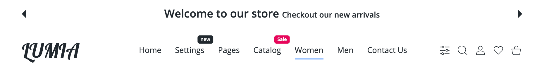
- COLORS - HEADER
- Global all parts of header (Background color, Text color, Link color, Link hover color, ...)
- Top part colorization (header-5,6) (Background color, Text color, Link color, Link hover color, ...)
- Middle(main) part colorization (Background color, Text color, Link color, Link hover color, ...)
- Bottom part colorization (header-2,3,4, with subcollections) (Background color, Text color, Link color, Link hover color, ...)
- Subcollections part colorization (Background color, Text color, Link color, Link hover color, ...)
- Global all parts of header (Background color, Text color, Link color, Link hover color, ...)
- COLORS - HEADER TRANSPARENT
- Global all parts of header (Background color, Text color, Link color, Link hover color, ...)
- Top part colorization (header-5,6) (Background color, Text color, Link color, Link hover color, ...)
- Middle(main) part colorization (Background color, Text color, Link color, Link hover color, ...)
- Bottom part colorization (header-2,3,4, with subcollections) (Background color, Text color, Link color, Link hover color, ...)
- Subcollections part colorization (Background color, Text color, Link color, Link hover color, ...)
- Global all parts of header (Background color, Text color, Link color, Link hover color, ...)
- COLORS - SWATCHES (Text color, ...)
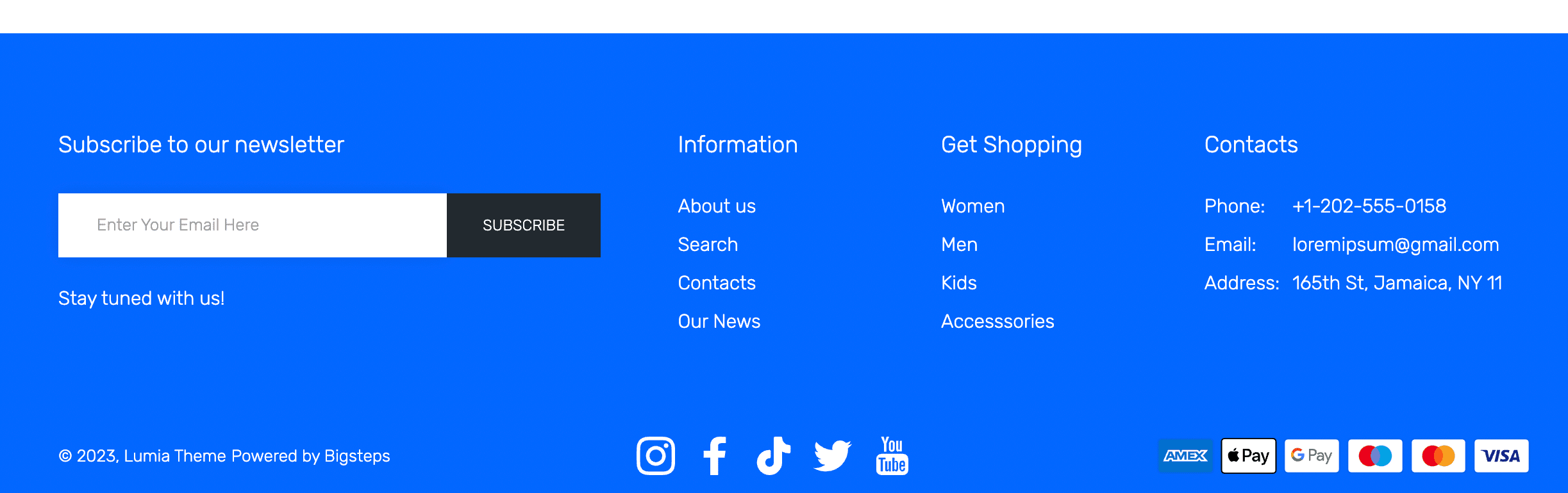
- COLORS - FOOTER
- Global all parts of footer (Background color, Text color, Link color, Link hover color, ...)
- Top part colorization (Background color, Text color, Link color, Link hover color, ...)
- Middle(main) part colorization (Background color, Text color, Link color, Link hover color, ...)
- Bottom part colorization (Background color, Text color, Link color, Link hover color, ...)
- Global all parts of footer (Background color, Text color, Link color, Link hover color, ...)
- COLORS - BUTTONS
- Global (Background color, Text color, Link color, Link hover color, ...)
- Primary (blue by default)
- Secondary (black by default) (Background color, Text color, Link color, Link hover color, ...)
- Third (grey by default) (Background color, Text color, Link color, Link hover color, ...)
- Fourth (white by default) (Background color, Text color, Link color, Link hover color, ...)
- Fifth (custom) (Background color, Text color, Link color, Link hover color, ...)
- Buy Now (Background color, Text color, Link color, Link hover color, ...)
- Global (Background color, Text color, Link color, Link hover color, ...)
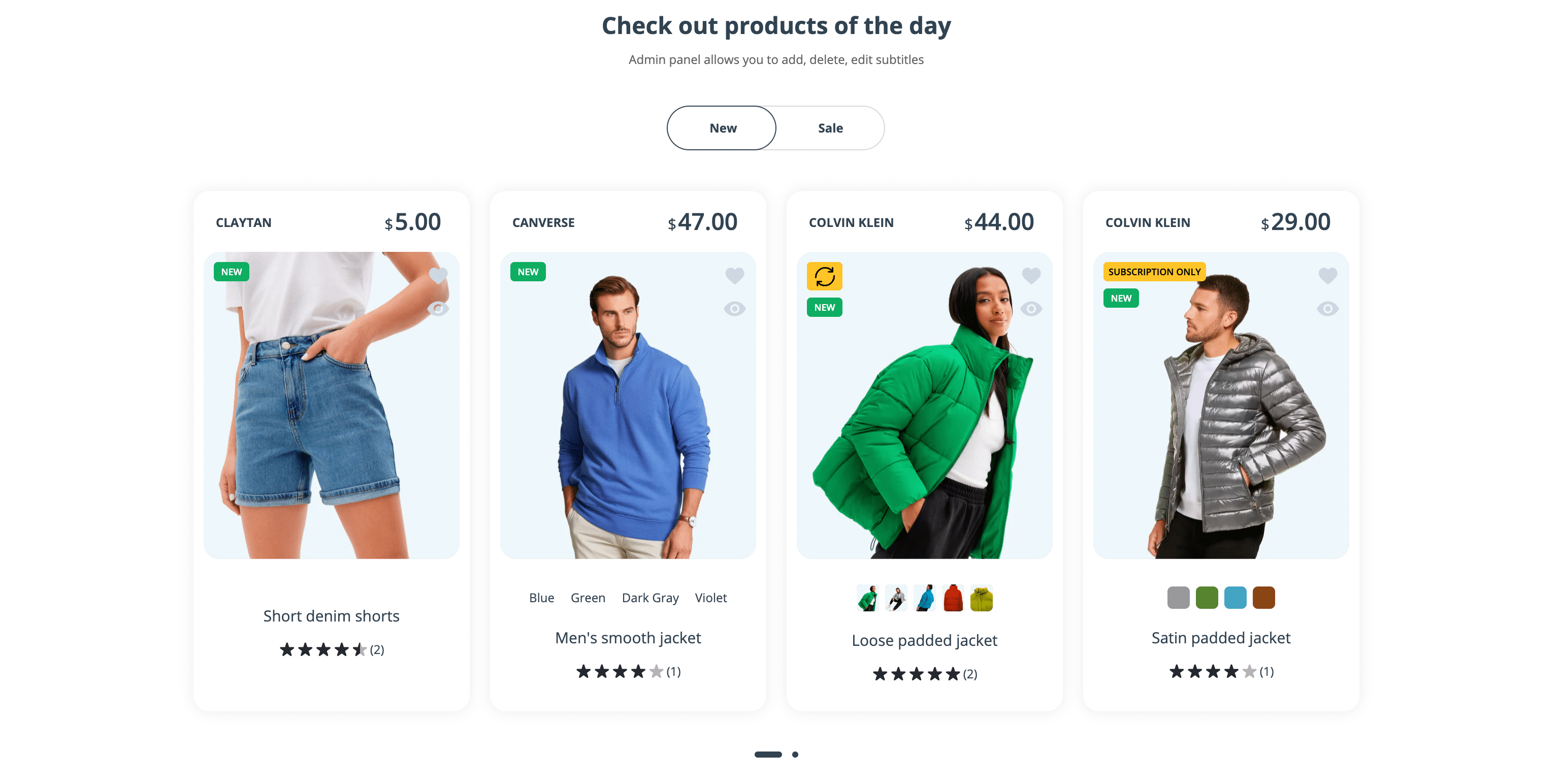
- COLORS - BADGES
- Global badges colorization (Background color, Text color)
- Bagde 1 (soldout product, navigation) (Background color, Text color)
- Bagde 2 (subscription product, navigation) (Background color, Text color)
- Bagde 3 (sale product, navigation) (Background color, Text color)
- Bagde 4 (new product, navigation) (Background color, Text color)
- Bagde 5 (navigation) (Background color, Text color)
- Bagde 6 (navigation) (Background color, Text color)
- Global badges colorization (Background color, Text color)
- COLORS - BANNERS (...)
- COLORS - INTERFACE ELEMENTS (...)
- COLORS - GENERAL SECONDARY (Background color, Text color, Link color, Link hover color, ...)
- COLORS - GENERAL PRIMARY (Background color, Text color, Link color, Link hover color, ...)
Theme Styles (presets)
All our skins in the demo are assembled with the help of preset color schemes made by us for different parts of the store. With the help of presets, you can change the style of the store globally or partially on the fly. This is very suitable for quick store builds in all styles.
Steps to apply preset theme style
- From your Shopify admin, go to Online Store > Themes.
- Find the Lumia theme that you want to edit, and then click Customize.
- Click Theme settings.
- Click Theme style.
- Select the preset you need.
- Click Change style to preview the changes.
- Click Save if you like new style.

You can apply one preset after another. Each preset is responsible for its own part of store, and in the end, you can completely modify the style of the store to match the corporate identity.
Available preset theme styles
Announcement bar color dark


Announcement bar color dark blue


Announcement bar color green


Announcement bar color grey


Announcement bar color orange


Announcement bar color white

Background color grey

Background color white

Buttons default

Buttons with stroke

Footer color black

Footer color blue default
Footer color blue and white
Footer color dark

Footer color grey

Footer color grey light

Footer color yellow

Global color apricot

Global color black-white
Global color dark

Global color grey-blue default
Global color yellow

Header color dark
Header color white default

Header color white-black

Header color white light

Header top color top black (№5, №6)

Header transparent color dark
Header transparent color white
SKIN BAGS
Presets that are applied:
- Typography Poppins
- Global color brown
- Footer grey light
- Background color white
- Header color white (default)
- Header transparent color dark
- Announcement bar color green
- Buttons default
- Own skin preset colors

How to apply skin preset
Follow the instruction here, but select the theme style SKIN BAGS.
SKIN CARPARTS
Presets that are applied:
- Typography Rubic 2
- Global color yellow
- Footer grey black
- Own skin preset colors

How to apply skin preset
Follow the instruction here, but select the theme style SKIN CARPARTS.
SKIN ELECTRONICS
Presets that are applied:
-
Own skin preset colors

How to apply skin preset
Follow the instruction here, but select the theme style SKIN ELECTRONICS.
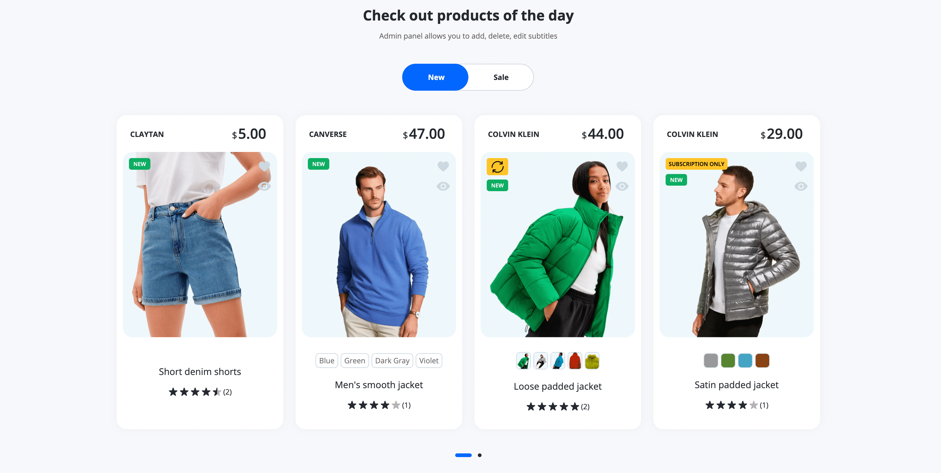
SKIN FASHION 1, 2 (DEFAULT)
Presets that are applied:
- Global color grey-blue (default)
- Background color grey
- Typography Open Sans (default)
- Footer color blue (default)
- Header color white (default)
- Header transparent color white
- Announcement bar color green
- Buttons default

How to apply skin preset
Follow the instruction here, but select the theme style SKIN FASHION 1, 2 (DEFAULT).
SKIN FASHION 3 (SOFT)
Presets that are applied:
- Background color white
- Global color apricot
- Typography Rubic Thin
- Footer color grey
- Own skin preset colors

How to apply skin preset
Follow the instruction here, but select the theme style SKIN FASHION 3 (SOFT).
SKIN FASHION 4 (STRICT)
Presets are applied:
- Global color black-white
- Background color white
- Header top color top black (№5, №6)
- Typography Rubic
- Buttons with stroke
- Own skin preset colors

SKIN NUTRITION (DARK)
Presets are applied:
- Global color dark
- Typography Asap Condensed
- Footer color dark
- Announcement bar color dark
- Own skin preset colors

How to apply skin preset
Follow the instruction here, but select the theme style SKIN NUTRITION (DARK).
SKIN PETS
Presets are applied:
- Background color white
- Own skin preset colors

How to apply skin preset
Follow the instruction here, but select the theme style SKIN PETS.
SKIN SHOES
Presets are applied:
- Background color white
- Footer color blue and white
- Own skin preset colors

How to apply skin preset
Follow the instruction here, but select the theme style SKIN SHOES.
SKIN TOYS
Presets that are applied:
- Background color white
- Typography Quickstand
- Footer yellow
- Header transparent color dark
- Announcement bar color green
- Buttons default
- Own skin preset colors

How to apply skin preset
Follow the instruction here, but select the theme style SKIN TOYS.
Typography Asap Condensed

Typography Open Sans default

Typography Poppins

Typography Quickstand

Typography Rubic

Typography Rubic 2

Typography Rubic Thin
