...
...
We would like to thank you for purchasing FOXic eCommerce HTML Template! Before you get started, please be sure to always check out this documentation.
If You have any questions that are beyond the scope of this documentation, please feel free to submit a ticket to https://big-skins.com/support
We're very happy to help you and you will get a reply from us faster than you expected. Thank you, we hope you to enjoy using FOXic eCommerce HTML5 Template!
Follow the steps below to get started with your site template:
FOXic Template follows a simple HTML code structure for every page. Here is the sample:
... .........
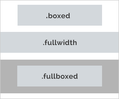
FOXic Template supports boxed & fullwidth page content blocks.
By default, each content section (.holder) is boxed. You can made it fullwidth or fullboxed by adding .fullwidth or .fullboxed classes.
See the image below:
The CSS files are used to change the template appearance like fonts-size, font-color, backgrounds, paddings, margins etc. You can edit the *.css files with any Code Editing Software.
You can find all .css files in the folder html/css.
For helping developers write more succinct CSS, and to keep files organized we use SCSS preprocessor. It is basically a scripting language that extends CSS and then compiles it into regular CSS.
You can find all .scss files in the folder html/scss.
In the file scss/_variables.scss you can change any settings for changing your site colour scheme. All variable names are as clear as possible and do not need a description. For example, for changing the colours of buttons you need to change these variables:
For example, for changing the buttons colors you need to change this variables://buttons $button_font_family_scss_var: $heading_font_family_scss_var !default; $button_font_weight_scss_var: 600 !default; $button_font_weight_less_scss_var: 500 !default; $button_font_weight_lg_scss_var: 500 !default; $button_color_scss_var: #fff !default; $button_bg_scss_var: $custom_color_scss_var !default;
FOXic Template has 10 different skins. Each skin has its own colour scheme and owns ready to use style.css file. For example, if you like Fishing skin, then add the file style style-vars-fishing.css
FOXic Template uses external fonts from Google Fonts Library by default. You can find the link to the font files in the head tag of the HTML files.
If you want to change the Google Font, you will need to edit the above links with your own font. If you want to use the self-hosted font, remove these links completely.
FOXic Template uses Bootstrap Grid (18 columns).
For more details on the Bootstrap Grid, please visit its official website.
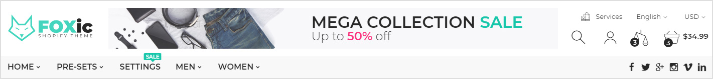
You can choose between 7 types of headers while creating your pages.


Each header has a similar HTML structure:
For disabling sticky header remove tag .hdr-content.hdr-content-sticky from the basic structure:
For making header transparent add class .hdr-transparent to the tag .hdr-wrap:

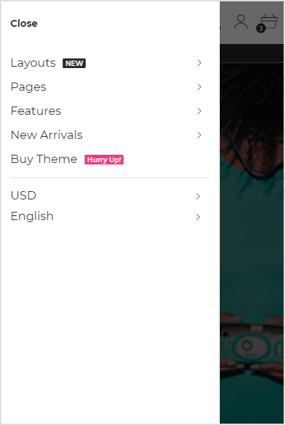
All headers, regardless of their structure on large screens, on mobile devices look like this:

The mobile menu is completely independent of the desktop version and has the following HTML structure:
We provide a very useful way to customize your menu.
Each menu item can be displayed in three different variants: no dropdown link, simple dropdown and megamenu link. Here is the basic megamenu structure:
Here is the Simple DropDown Link code example:
You can use unlimited levels of submenus.
You can use the megaMenu in 2,3,4 & 5 Columns. Also you can add Left and(or) Right custom block to the megaMenu. MegaMenu grids and codes are provided below:
| Description | MegaMenu Blocks | Code Example |
|---|---|---|
Only categories columms |
Categories.column-5, .column-4, .column-3, .column-2, .column-15 column .column-5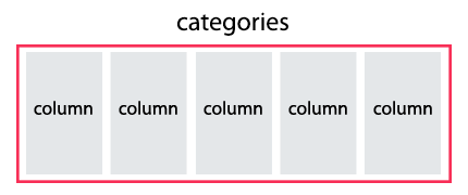
2 column .column-2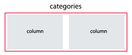 |
|
Left Block + Categories Columns |
Left Block.width-20, .width-25, .width-33, .width-40Categories Columns.column-5, .column-4, .column-3, .column-2, .column-1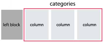 |
|
Right Block + Categories Columns |
Right Block.width-20, .width-25, .width-33, .width-40Categories Columns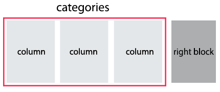
|
|
Left Block + Right Block + Categories Columns + Bottom Row |
Left Block.width-20, .width-25, .width-33, .width-40Right Block.width-20, .width-25, .width-33, .width-40Categories ColumnsBottom Row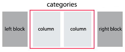
|
|
You can choose between 7 types of footers while creating your pages.


